
Building A Responsive Component Using CSS Container Queries and Grid Layout
Ever wonder how to use the new CSS Container Queries? Today I'll show you how to build a two column image and text component using the new CSS container queries and grid.

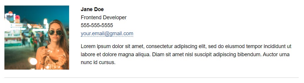

There are many examples of this component all over the web. YouTube, Airbnb, and Design Milk all use variations of this image with text layout. It makes sense; this popular layout paradigm organizes content visually, allowing users to scan through a long list of entries quickly.
Building something like this can often be tricky. Luckily we have the new CSS container queries and Grid Layout to help us bake in flexibility and responsiveness. Both Grid and Container queries have strong support across major modern browsers and can be used right now!
The Context:
This component can stand alone or be used in multiple. For this example, I’ve used it as a way to list employees of a fictitious web development company:

A Few Requirements:
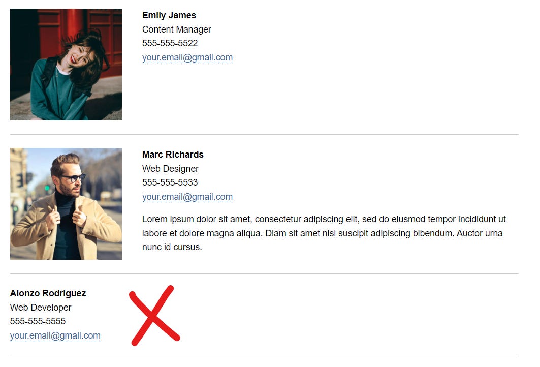
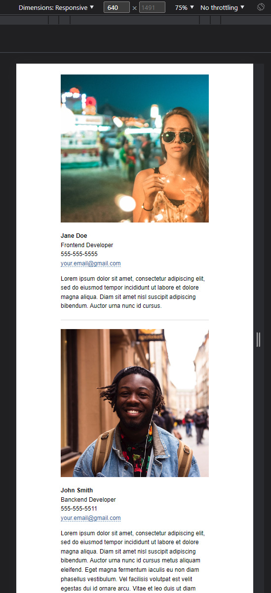
The component should be a single column at 600px or less and two columns at 600px or greater.
At greater than 600px, the component must maintain two columns, even without an image. I found a great solution from Rachel Andrew on how to style empty grid cells using pseudo-elements. To see that solution, skip to the section Writing the CSS.
use Grid Layout
Writing the HTML
Container queries allow you to apply styles to an element based on the size of its container. Developers no longer need to rely solely on the width of the viewport to change a component’s layout (as with traditional media queries).
First, I’ll create a container:
<div class="listing-container">

</div>
Next, I’ll add the element that I want to target in the query, the listing itself:
<div class="listing-container">
    <div class="listing">

    </div>
</div>
And inside the listing goes the content:
<div class="listing-container">
    <div class="listing">
        <img class="listing-image" src="/assets/girl-with-lights.jpg" alt="">
        <div>
            <p class="listing-data"><strong>Jane Doe</strong></p>
            <p class="listing-data">Frontend Developer</p>
            <p class="listing-data">555-555-5555</p>
            <p class="listing-data"><a href="">your.email@gmail.com</a></p>
            <p class="listing-data spacing-sm">Lorem ipsum dolor sit amet, consectetur adipiscing elit, sed do eiusmod tempor incididunt ut labore et dolore magna aliqua. Diam sit amet nisl suscipit adipiscing bibendum. Auctor urna nunc id cursus.</p>
        </div>
    </div>
</div>
Notice the utility class “spacing-sm” in the last paragraph element. I chose to use a utility class because I only want to apply margin-top to this element when it is present. It is possible to use a combination of pseudo-classes like :last-child, :has() and :not() to achieve this, but be careful, :has() is not well supported in Firefox.
Writing the CSS
First I’ll write some general styles for resets, typography, and links. I’ll also write the rules for my “spacing-sm” utility class.
/* reset */

*,
*::before,
*::after {
  box-sizing: border-box;
}

body,
h1,
h2,
h3,
h4,
p {
  margin: 0;
}

img,
picture {
  max-width: 100%;
  display: block;
}

/* typography */

body {
  min-height: 100vh;
  padding: 20px;
  font-family: 'Open Sans', sans-serif;
  font-size: 1rem;
  text-rendering: optimizeSpeed;
  line-height: 1.5;
}

h1 {
    color: #369;
    margin-block: 2rem;
    text-align: center;
}

p {
    line-height: 24.889px;
}

a {
    color: #369;
    text-decoration: none;
    border-bottom: dashed #369 1px;
}

.spacing-sm {
    margin-block-start: 1rem;
}
At widths less than 600px, the component should be a single column. A lot of the work is already done for us by the browser:
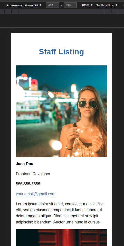
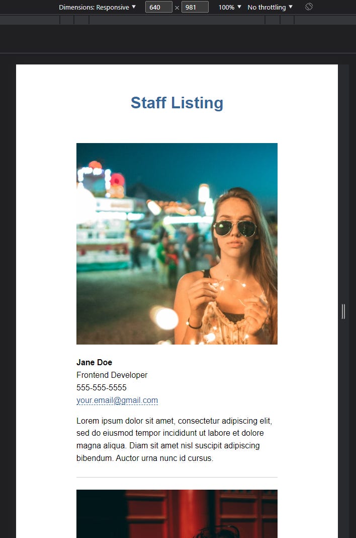
So all that’s left is to adjust the padding, set a max-width of 400px, and add a bottom border to each listing. For demo purposes, I’ve included “margin-inline: auto” to keep the component in the center of the viewport. I also add margin to the bottom of the image.
/* listing */

.listing {
    max-width: 400px;
    margin-inline: auto;
    padding-block: 1.5rem;
    border-bottom: solid #CCC 1px;
}

.listing-image {
    margin-block-end: 1.5em;
}
Here’s what the component looks like so far:
Declaring the Containment Context
To use container queries I must first declare a containment context. In other words, I need to tell the browser that I will be querying the dimensions of the container element at some point.
To do this, I’ll select the container element and apply the “container-type” property:
.listing-container {
    container-type: inline-size;
}
Three possible values can be used with the “container-type” property: “size”, “inline-size”, and “normal”. Here I’ll use “inline-size”. This will base the query of the container’s dimensions on the inline size only. This is handy since I want to change the layout of the container based solely on its width. For full definitions of the other property values, refer to the MDN container queries page.
I’ll also choose to include the optional “container-name” property and give it the value of “listing”. This way I can target specific containers in our query. If no container name is specified, the query will apply styles to the nearest ancestor that has a containment context.
*Note the optional short-hand property “container” that combines both “container-type” and “container-name” into one property.
/* the containment context */

.listing-container {
    container-type: inline-size;
    container-name: listing;
}

/* optional short-hand version */

.listing-container {
    container: listing / inline-size;
}
Declaring the Container Query using “@container”
After declaring a containment context I will build the query using “@container”. As with media queries, container queries use conditions to apply a set of rules to selected elements. Every time the container changes size (in this case a change in the inline size only) the browser will reevaluate the condition and apply styles if the condition is true.
First, I’ll declare the at-rule and specify the name of the container(s) I want to query:
@container listing () {

    /* styles go here */
}
Since I want to apply different styles to the listing when its container is larger than 600px, I’ll set a condition with those parameters:
@container listing (width > 600px) {

    /* styles go here */
}
This query will filter for any containment context with a container name of “listing” and apply styles if its width is larger than 600px. Pretty cool!
Setting up the Grid
Grid is a great layout tool that can easily transition the listing from a single column to two columns.
First, I’ll select the listing element and give it “display: grid”. This sets up the layout of the listing’s children (the image and the div wrapping the text) to be placed in a grid. I’ll also give the listing a max-width of 910px.
@container listing (width > 600px) {

    .listing {
        display: grid;
        max-width: 910px;
    }
}
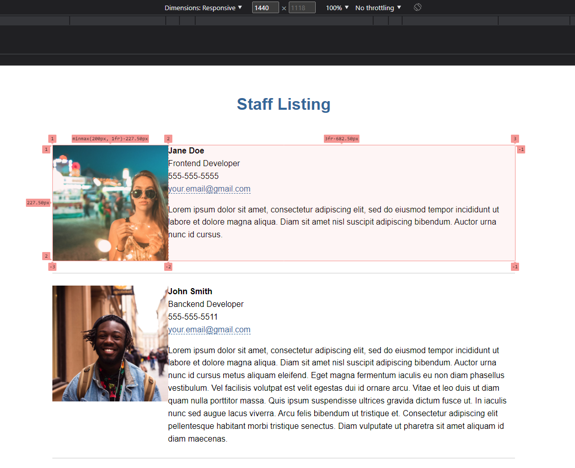
Next, I’ll use the property “grid-template-columns” to set up the two columns. To ensure the image doesn’t get too small, the first column should be a minimum of 200px wide and at a maximum, take up 1/4 (1fr) of the available space. The second column can then take up the remaining 3/4 (3fr) of available space.
Luckily I can easily achieve this using the CSS minimax() function and fr units:
@container listing (width > 600px) {

    .listing {
        display: grid;
        grid-template-columns: minmax(200px, 1fr) 3fr;
        max-width: 910px;
    }
}
Looking at the component in Chrome dev tools reveals that our grid is set up as intended.
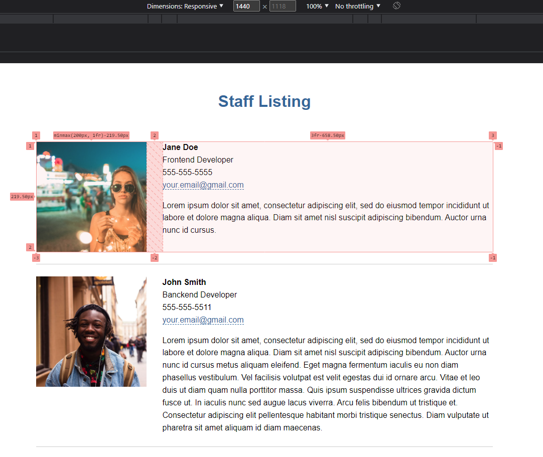
Lastly, I’ll add a small grid gap to make sure there’s plenty of space between the columns.
@container listing (width > 600px) {

    .listing {
        display: grid;
        gap: 2rem;
        grid-template-columns: minmax(200px, 1fr) 3fr;
        max-width: 910px;
    }

}
A quick look in Chrome dev tools reveals the fancy math being done by the browser. Our component has a total width of 910px. Subtracting 32px (the gap) gives 878px. Divide that by 4 gives 219.50px, which is the exact size of the first column! Isn’t CSS wonderful?!
Avoiding the column collapse
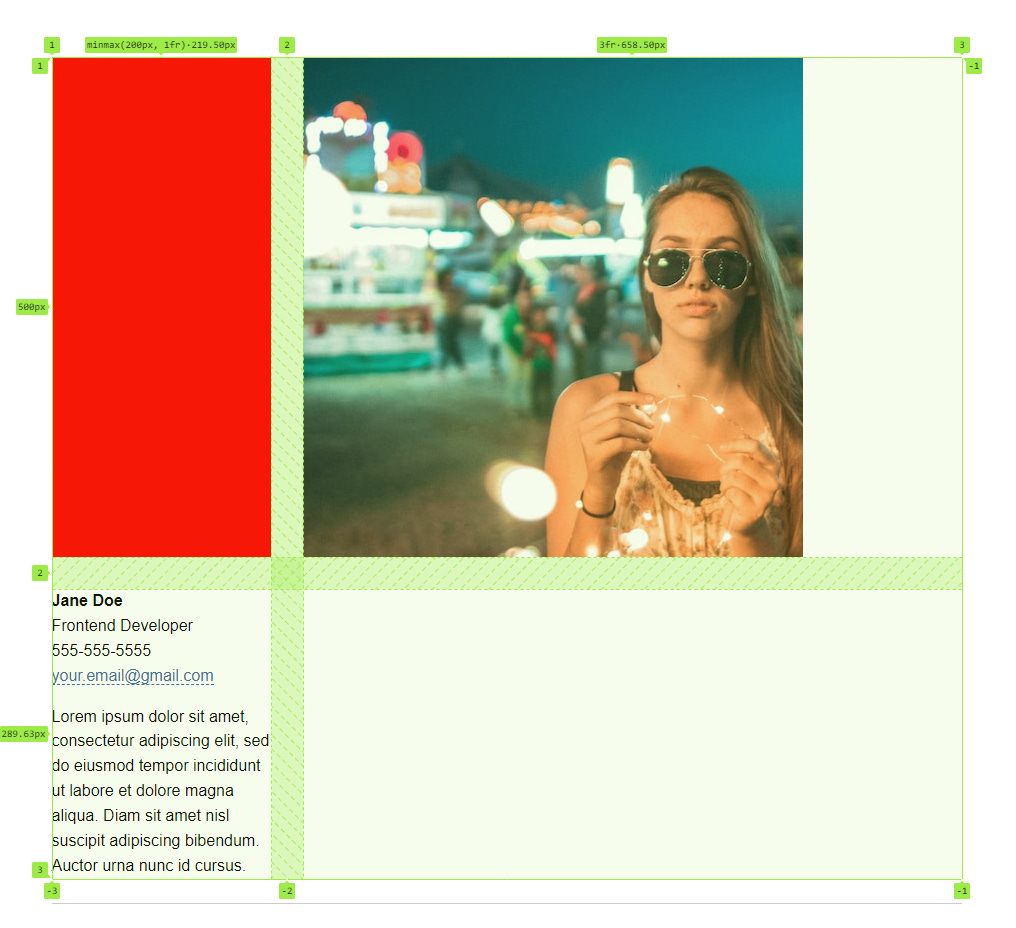
Currently, the first column will collapse if there is no content to fill it. Initially, I wrapped the image in a div and gave it a width. But this solution felt clumsy and I didn’t want any unnecessary markup.
I found a really great solution from the Dutches of CSS Rachel Andrew. She uses a pseudo-element (:after or :before) to generate content and then explicitly places the pseudo-element into the grid.
@container listing (width > 600px) {

    /* other styles */

    .listing:before {
        content: "";
        background-color: red;
        grid-column: 1 / 2;
        grid-row: 1 / 2;
    }
}
Since I’ll always want the image in the first column, I will explicitly place it the same way Rachel placed the pseudo-element.
@container listing (width > 600px) {

    /* other styles */

    .listing:before {
        content: "";
        background-color: red;
        grid-column: 1 / 2;
        grid-row: 1 / 2;
    }

    .listing-image {
        grid-column: 1 / 2;
        grid-row: 1 / 2;
        margin-block-end: 0;
    }
}
Explicitly placing both elements in the same grid cell causes the image to overlap the pseudo-element, ensuring the first column will remain a column, even without content. All while avoiding unnecessary markup. Awesome! I also removed the bottom margin using the CSS logical property margin-block-end.

Take a look at the finished component, live on codepen.

Conclusion
Container queries are a great tool when building components. They allow components to have control of their own layout, which is handy in today’s highly component-based development ecosystems.
Check out more articles and my other projects on my website.
Image credits:
All images are downloaded from Unsplash.